Background
I was tasked with reimagining the claims experience as part of the larger Independence Blue Cross member portal overhaul. The claims experience is one of the most frequented areas within the member portal, but the current experience is one of the largest causes of confusion, complaints, and customer service calls. While the breadth of this project was to enhance the entire claims experience, this case study will be focusing on a few larger pain points for users.
Case study overview
Methods Used: Feature Analysis, Ideation Sessions, Wireframing, Prototyping, Usability Testing
Tools Used: Figma, Usertesting.com, Mural
Timeline: 6 weeks
Role(s): UX Design, Visual Design
Members felt lost navigating the claims process
Members need a way to track detail on claim's status through the adjudication process.
Comprehensive research was conducted by our dedicated member experience team which uncovered that members felt they did not understand what was happening with their claim. Claims can take awhile to process, and members do not have any idea what was happening with their claim. This leads to customer service calls for updates on claim status and explanations of claim statuses.
UX Takeaways
1. How might we create an experience where a member feels in control of their health journey through claims?
2. How might we provide reduce customer service calls through education to the member around claims?
3. How might establish trust with the member through claim transparency?
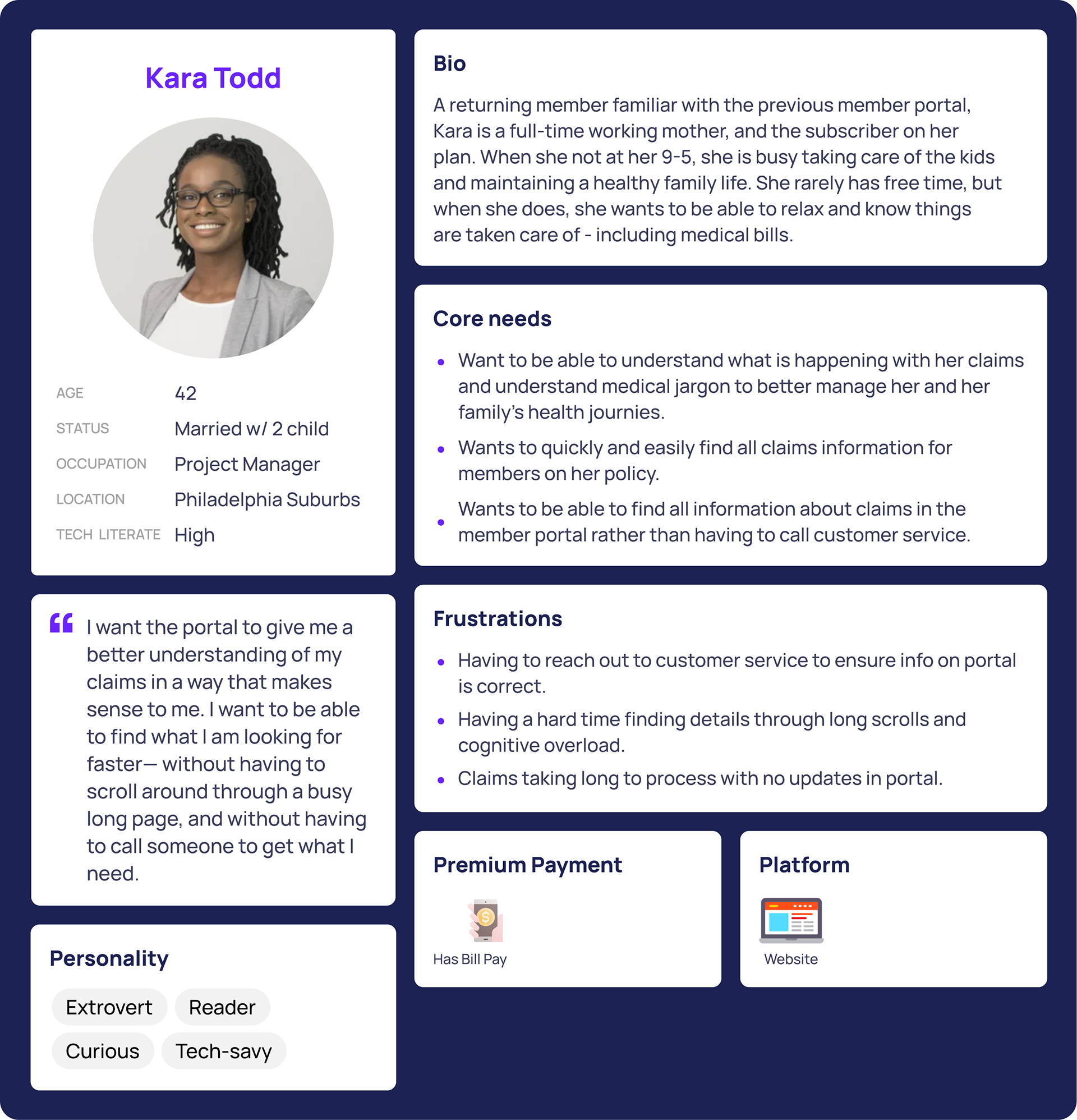
Personas
The research and analysis in step 1 helped me to craft a user persona for our core user - a subscriber. This persona helped me better empathize with where our user is coming from, and their needs and frustrations.
Goals
Before I began designing, I set myself clear goals based on the research synthesis.
1. Design an experience that allows for deeper member engagement and understanding of their claims and spending.
2. Design an experience that is more friendly and accessible.
3. Design an experience that instills trust with our members.
Design process
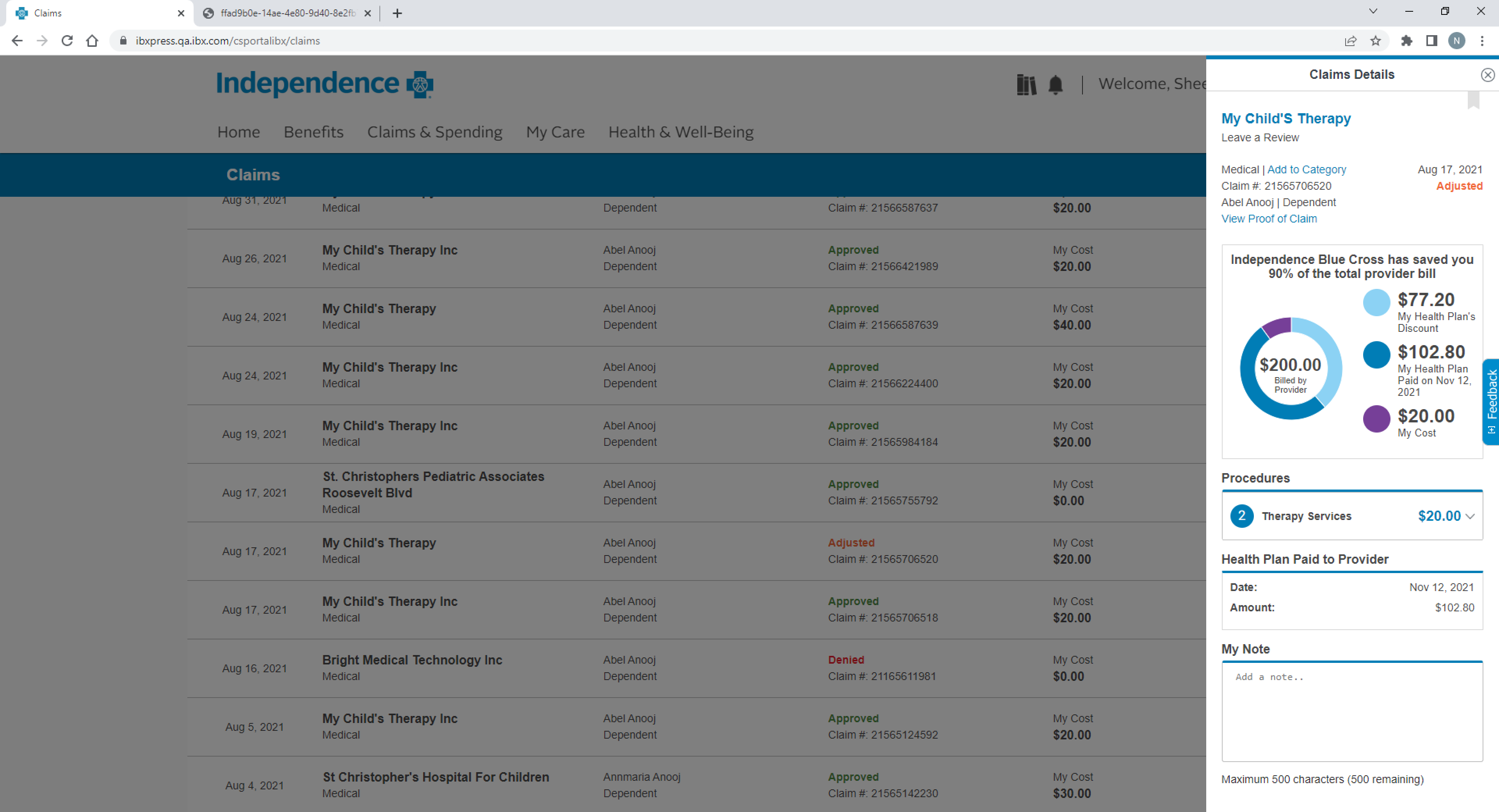
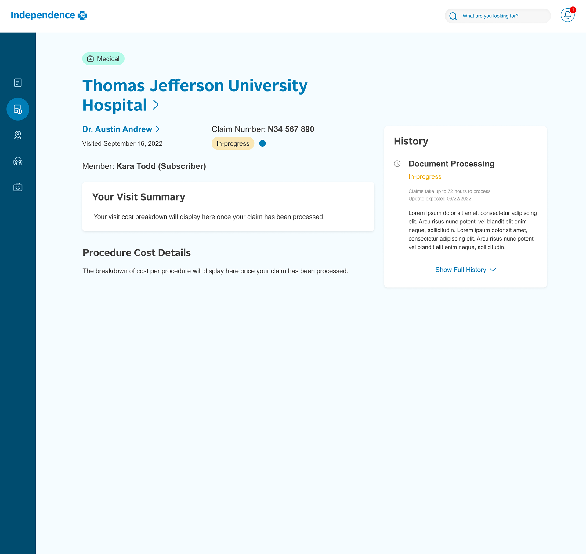
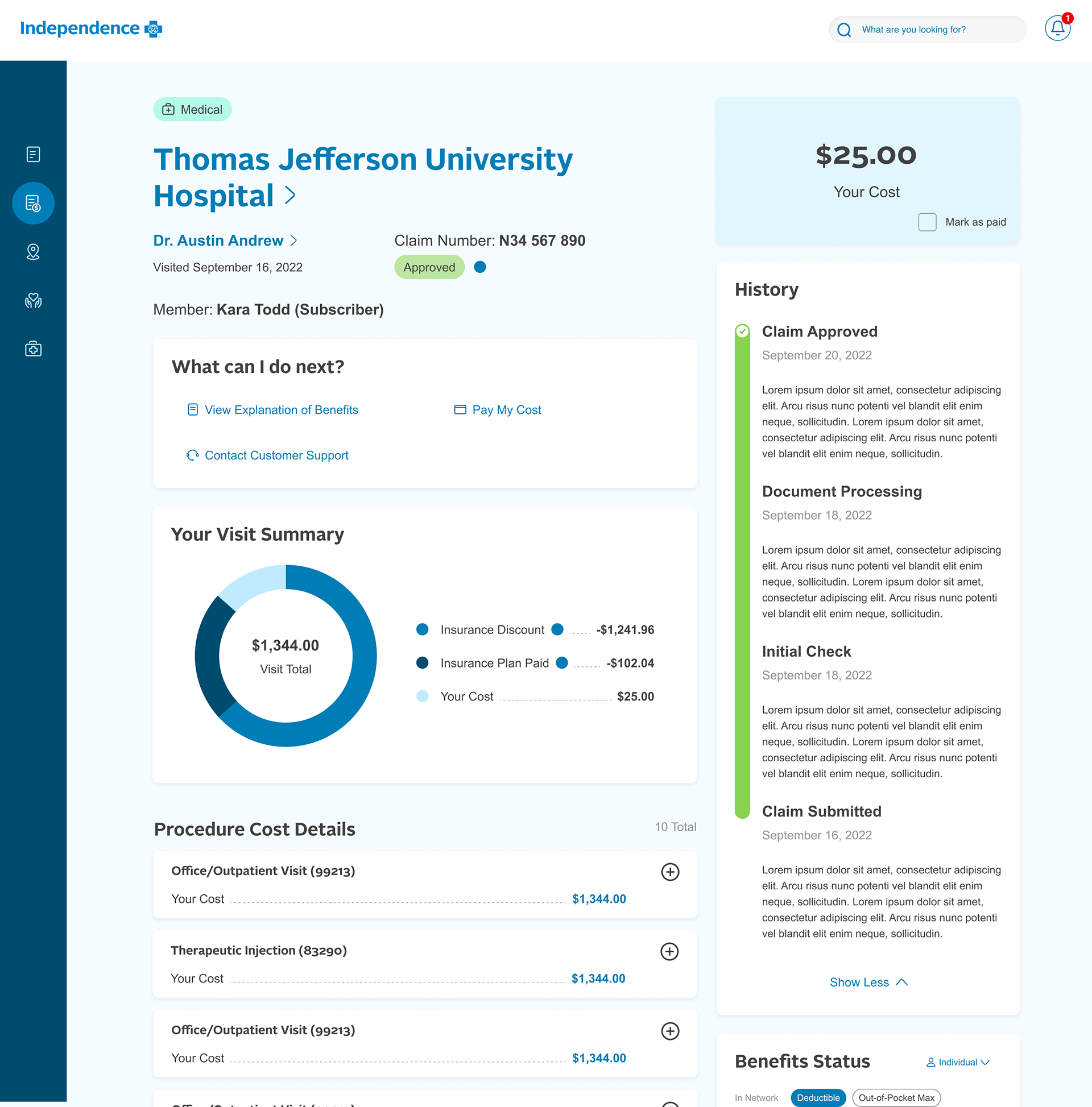
I started by auditing the current experience where I saw that the claims details were displayed to a small drawer view, which made view claims information feel restricted. I discovered that no education information existed around claims status or claim journey.
Additionally, the member portal reimagine initiative was kicked-off with work done by a contracted agency in order to receive business support. This gave me a few designs to look at for claims details and a live claims tracker feature.
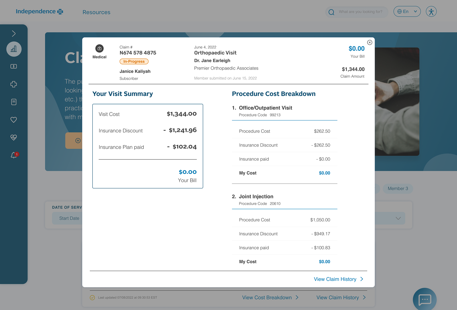
After reviewing the agency work, I had a good idea of what a claims tracker could look like and the most important information to display for our members. However, I noticed that the modal view for claims details was leading to claims history and claims breakdown needing to be split into to different views, causing a fragmented experience when viewing claims.
Pulling together member experience team members, product owners, and UX designers, I ran an ideation session where we began to explore design solutions, including live tracking.
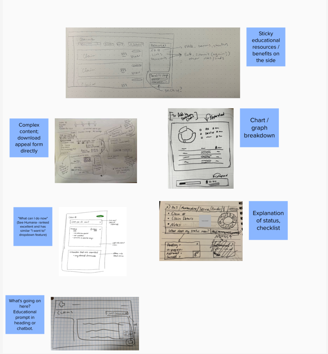
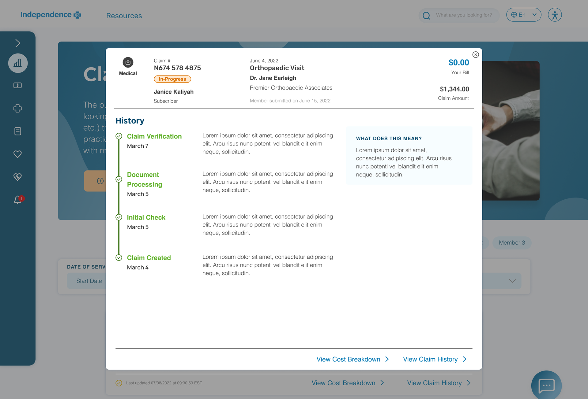
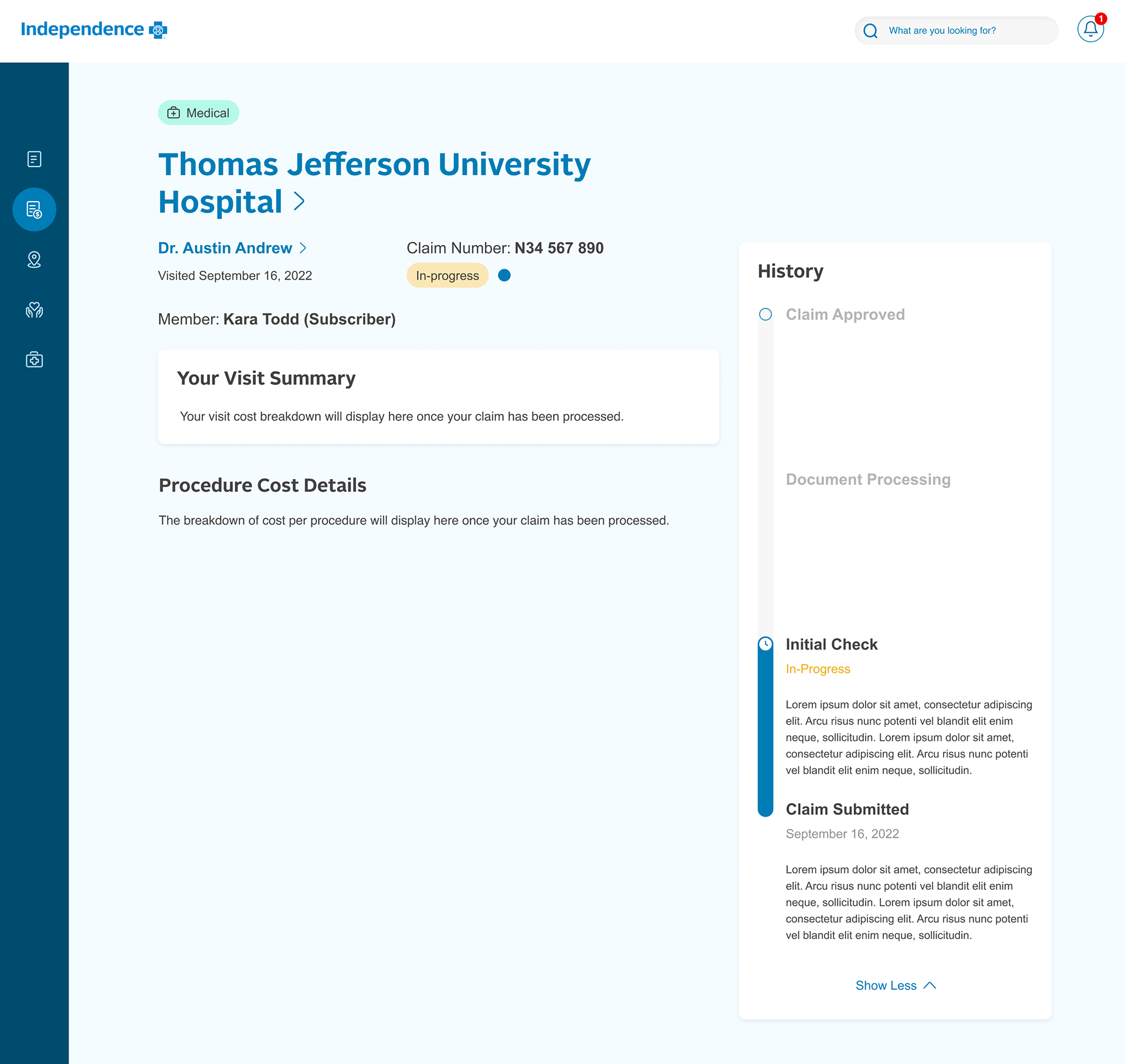
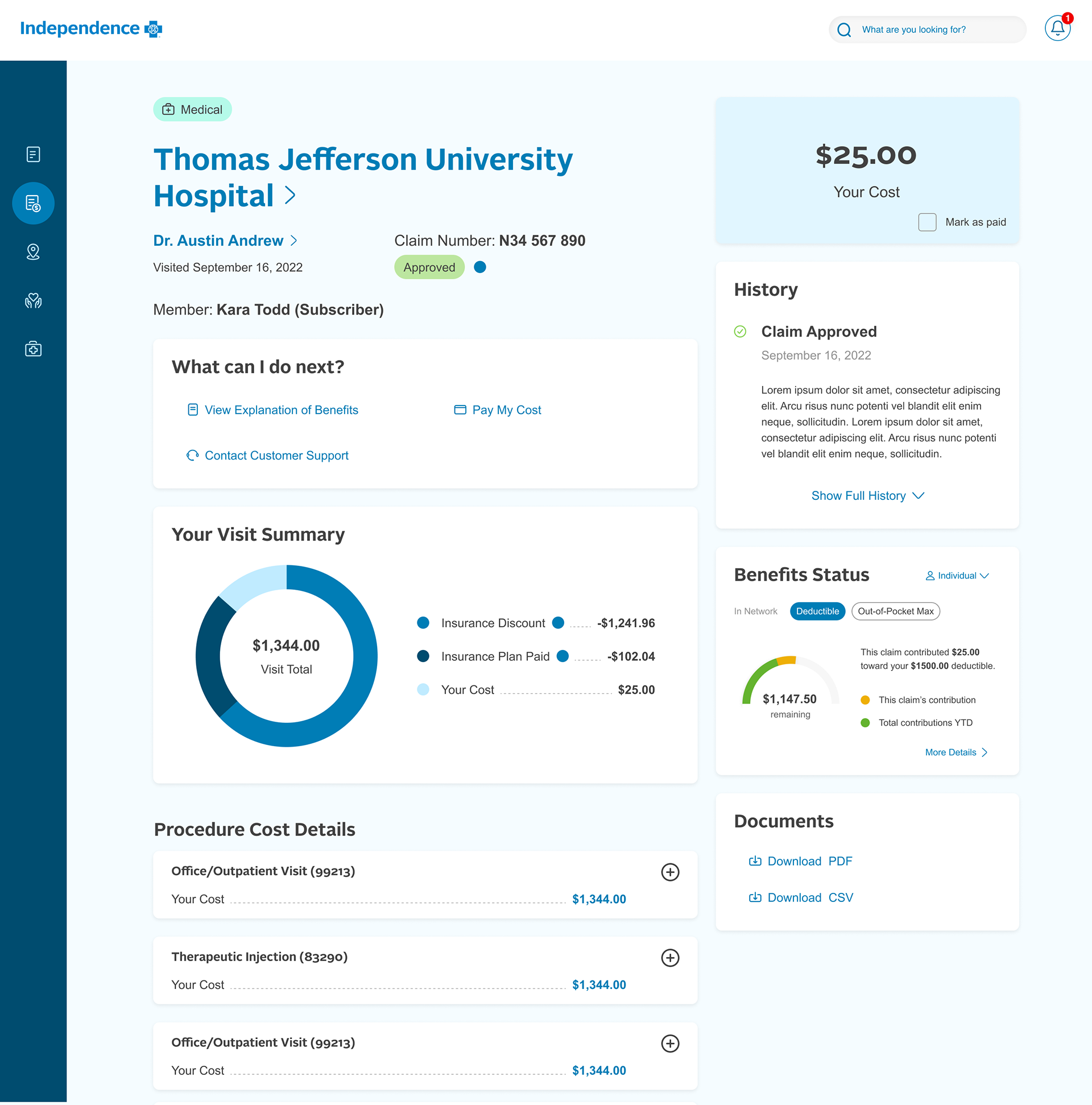
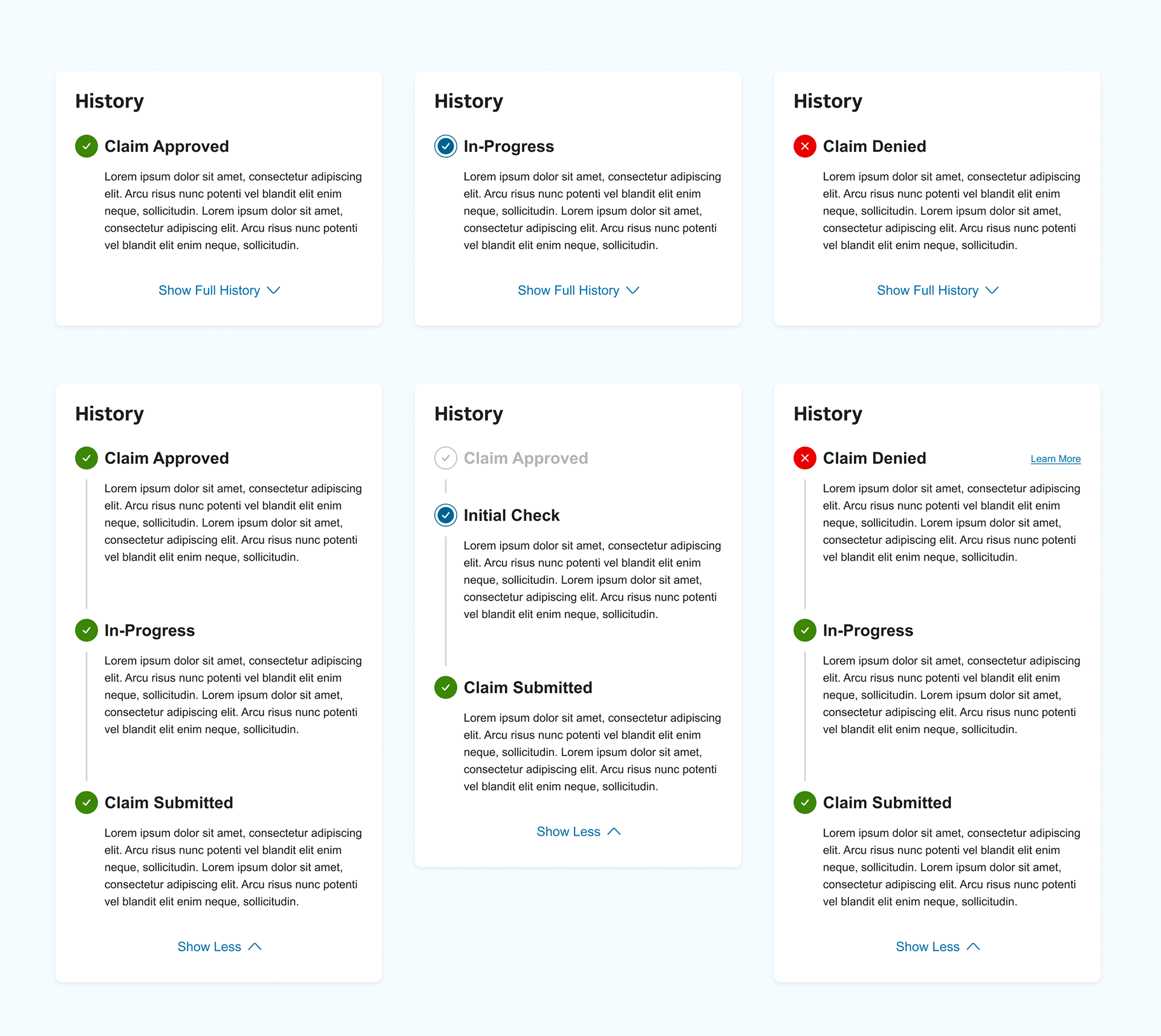
Early iterations of a full-page claim details put everything together in a holistic view for members, including seeing their claim history. I focused on a collapsable history card to not create cognitive load but still allow the member to see all history details by expanding the module.
Roadblock: development constraints
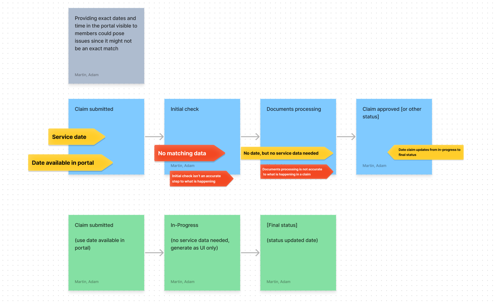
Once I had designs for the feature, I met with my lead developers to discuss the tracker and get their input. I discovered through this conversation that the claim's service did not data to support the steps outlined in the tracker.
We would not be able to develop the claim tracker.
Next steps
While the news from developers was disappointing, I still wanted to investigate this further. Knowing the tracker was a addressing a huge pain point for our members, I was inclined to still pursue a solution. I thought there had to be something we could do with the data available.
I setup an ideation session with developers to go over the research and the why to this feature to solicit their by buy in and begin facilitating open conversation about possibilities for our MVP launch.
We dug into the service data and began to discover some data points that we could present as steps in the claims process. Ultimately, I had to shave steps off of the tracker, but we found a good compromise in the data.
Finalized designs
Finalized designs were made with adjustments to the steps based on the ideation session with developers. Additionally, the UI was updated to be streamlined, light, and easy to read/scan.
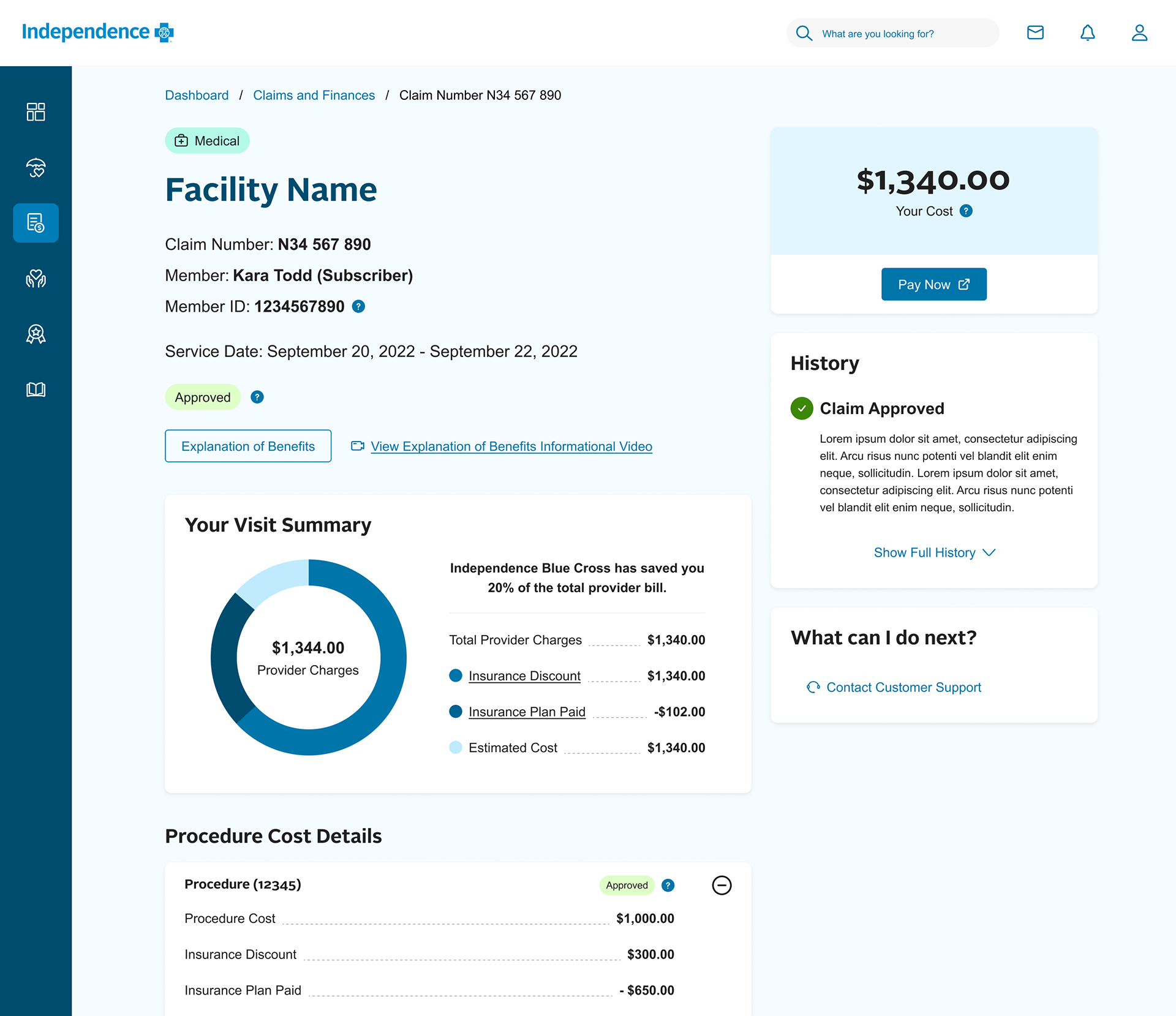
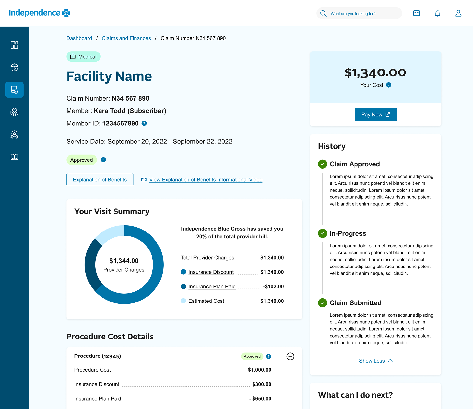
Examples of each primary status
Conclusion and a note on usability testing
Though not outlined in this case study, usability testing was completed throughout the design process to validate the design solutions were meeting the needs and expectations of users. The redesign of claims was done in close cross-functional teamwork with member experience, product owners, and developers.
In conclusion, I successfully created new feature enhancements within the claims experience to address our members' main pain points. Through the use of educational elements like the live tracker, the experience now facilities deeper understanding of health insurance, increases trust towards claims processing, and makes health insurance more accessible and friendly.
Where do we go from here?
Next steps include continuing to iterate on new features for claims deemed out of scope for MVP. Additionally, we will be analyzing user feedback throughout our pilot and full migration launches to understand how the redesigned claims experience is work or not working for members.