The Project
The Clean Spaces app enables clean rooms to modernize record-keeping, offering a user-friendly platform for direct data input. Businesses can effortlessly generate charts, reports, and maintain a thorough cleanroom audit log that complies with FDA regulations.
The Problem & The Goals
The heuristic evaluation of the mobile application was conducted to proactively identify and rectify usability issues at an early stage of development. By applying established usability heuristics, I aimed to align the application with user expectations, industry best practices, and optimize the overall user experience and interface look and feel. The insights gained from this evaluation informed refinements to the app's interface, ensuring it delivers an enhanced and user-friendly experience prior to release.
Methodology
I applied Jakob Nielsen’s 10 user experience heuristics:
1. Visibility of system status
2. Match between system and the real world
3. User control and freedom
4. Consistency and standards
5. Error prevention
6. Recognition rather than recall
7. Flexibility and efficiency of use
8. Aesthetic and minimalist design
9. Help users recognize, diagnose, and recover from errors
10. Help and documentation
Severity Rating Scale
I used the following severity scale to rank the priority of each issue found.
Critical (5): Severe usability issue that prevents users from completing essential tasks, leading to a significant negative impact on the user experience. Requires immediate attention and resolution.
High (4): Serious usability issue that hinders users in completing important tasks, causing notable frustration or confusion. Should be addressed promptly to improve the user experience.
Moderate (3): Usability issue that affects user experience to a noticeable extent but doesn't completely prevent task completion. Requires attention and improvement to enhance overall usability.
Low (2): Minor usability issue that might cause slight inconvenience or confusion but has a limited impact on the overall user experience. Can be addressed in future updates for incremental improvement.
Cosmetic (1): Aesthetic or minor usability concern that does not significantly impact functionality or overall user satisfaction. Considered lower priority and may be addressed during routine maintenance.
The Evaluation
First Issue/Violation
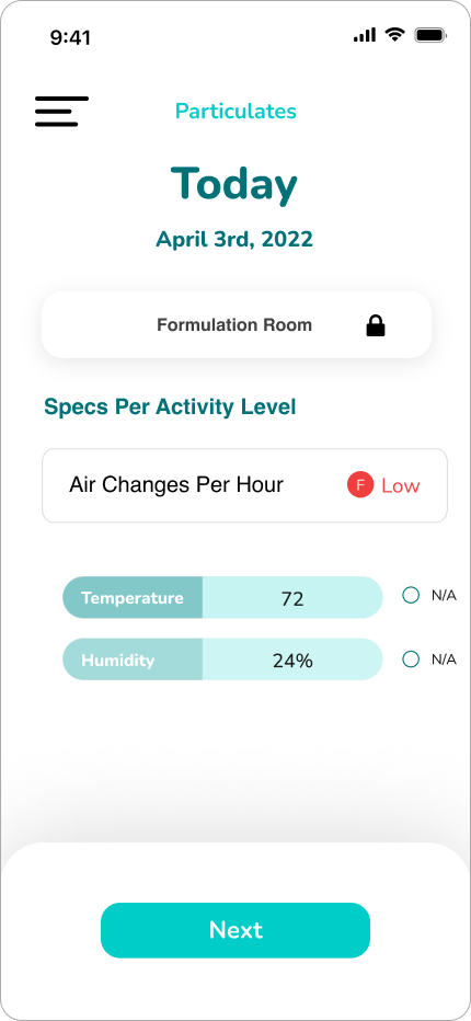
Icon button being used as home button is a not a universal standard symbol for home.
Severity: 3
Heuristics violated: Consistency and standards
Description: The heading uses a hamburger menu while the button does not open a menu rather takes the user back to the homepage. This will pose a confusing and unexpected interaction for users. Additionally, the hamburger menu is very large and takes up valuable screen real estate.
Solution: Replace the hamburger menu icon with a home icon to more accurately communicate to the user what the function of the button.
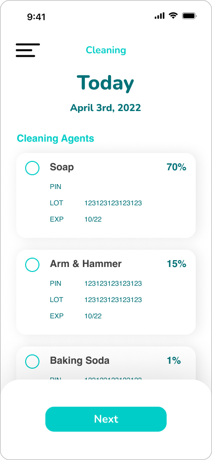
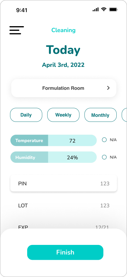
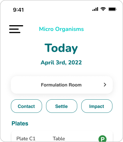
Before: home button was using a hamburger menu though it navigates users directly home and does not open a menu.
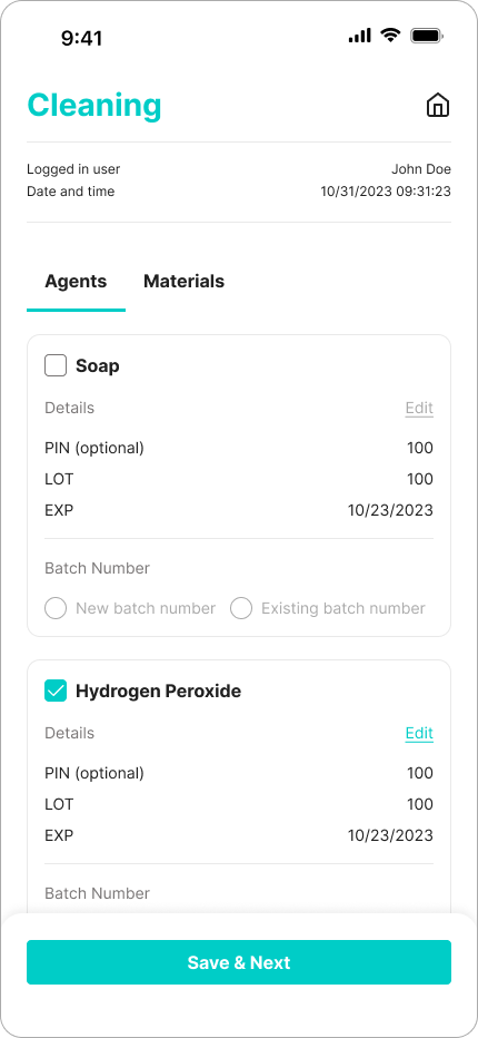
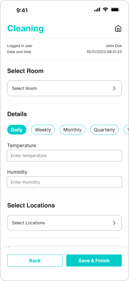
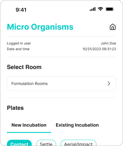
After: hamburger menu icon was replaced with home icon to better communicate functionality.
Second Issue/Violation
Inconsistent and unfamiliar text input fields throughout the app.
Severity: 5
Heuristics violated: Consistency and standards
Description: Throughout the app styles for input fields do not align with industry styles which makes the functionally confusing. Users will inevitability be unsure if and where they are supposed to enter data
Solution: Replace all input fields with on consistent style that align with industry standards and have both label and placeholder for accessibility.
Before: unfamiliar input field style that does not communicate function.
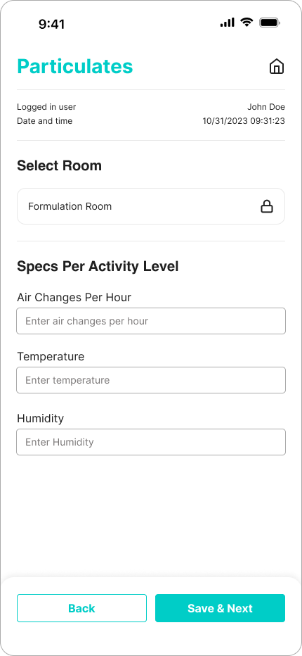
After: input fields follow industry best practices with label and placeholder text and are recognizable to the user.
Third Issue/Violation
Throughout the app, drop shadows are not used consistently or intentionally to enhance the user experience.
Severity: 2
Heuristics violated: Aesthetic and minimalist design
Description: Misuse of drop shadows was hindering the user experience by miscommunicating affordance and interactivity. For example, one element was raised with drop shadow to communicate interactivity, while another was raised which was not interactive at all. Page hierarchy was unclear and caused the users' eye to jump around the screen.
Solution: Reduce the use of drop shadows overall. User drop shadows strategically to communicate hierarchy and importance.
Before: drop shadow usage was hurting hierarchy and miscommunicated affordance and interactivity.
After: drop shadow usage is reduced and only used to communicate importance of elements, actions, and layers to user.
Fourth Issue/Violation
The time log at the top of every page was taking up too much valuable screen real estate and not communicating the most helpful and required information for the user.
Severity: 5
Heuristics violated: Aesthetic and minimalist design
Description: Time stamping is very important to the function of the application. The logged in users' actions and time of action are logged at all times when using the application, so each screen needs to have a time log along with the logged in user. The current heading only provides the date.. Additionally, the word "Today" is taking up too much space and provides no valuable feedback to the user.
Solution: Redesign the header to include the date, hour, minutes, and seconds, along with the logged in users name. Additionally, reduce the size of the font so that important information below is higher up in the users' view.
Conclusion
In conclusion, the heuristic evaluation of the mobile application was conducted with the primary objective of assessing its usability and identifying potential areas for improvement. The positive outcomes derived from this evaluation underscore the application's user-friendly design, intuitive navigation, and adherence to established usability heuristics. The process not only affirmed the effectiveness of the application in meeting user needs but also provided valuable insights for further enhancement. By embracing a user-centric approach and incorporating the feedback gathered through heuristic evaluation, the mobile application is well-positioned to deliver an even more seamless and satisfying user experience in the future, fostering user engagement and overall satisfaction.