The Problem
As part of our initiative to create a multi-product design system, I created a proof of concept for how building out a strong design token taxonomy could be highly advantageous for our product teams. The follow pain points from our product teams I address in the proof of concept.
1. Inconsistency in style application
2. Lack of robust central source of truth for styling
3. Lack of parity between design system and code
4. Time consuming updates
5. Communication challenges with other designs and development teams
6. Currently, no streamlined way to enable theming across enterprise platforms
2. Lack of robust central source of truth for styling
3. Lack of parity between design system and code
4. Time consuming updates
5. Communication challenges with other designs and development teams
6. Currently, no streamlined way to enable theming across enterprise platforms
Value Add
Implementing design tokens in a design system offers significant value for both design and development, ultimately resulting faster product development cycles.
- Standardize and provide design intent for elements, such as colors, typography, and spacing, to ensure a consistent application across products and product features.
- Streamline design processes to reduce redundancy and save maintenance and updating time for designers and developers.
- Make it easier to add new elements to the design system in a cohesive and consistent manner.
- More efficiently expand the enterprise’s product portfolio and enable theming and branding of individual products.
How Design Tokens Can Help
Design tokens create a shared understanding of visual style usage and creates parity between design and code.
Design Token Objectives:
- Provide clarity and consistency
- Keep generic but actionable
- Use intent-oriented taxonomy
- Keep generic but actionable
- Use intent-oriented taxonomy
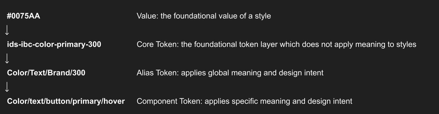
Token Tiers
There are multiple levels of design tokens, progressively applying more meaning and intent to the application of the style they are referencing. At the time of this POC, Independence Blue Cross had only established tokens up-to the core token level. Therefore, the token system provided no application and intent guidance to designers and developers. This was resulting in inconsistent use of styles and components. Additionally, it was resulting in developed code that did not allow our design system to make surgical updates to color style application
For instance, because the existing design tokens are not specific, the same token was being used for card stokes and hover states. Therefore, if we wanted to updated the color for card strokes, we would need to manually update all of the instances of strokes in Figma, and development would have to update all instances of the stroke color in production.
The solution? Creating alias tokens and component tokens to provide global and component specific meaning and design intent.
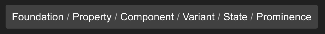
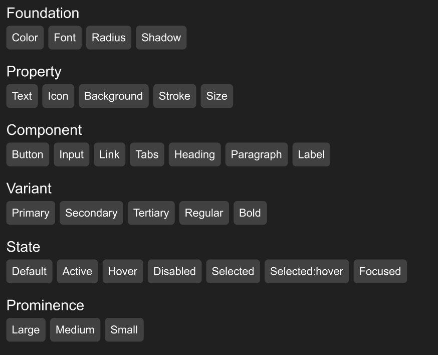
Developing a Taxonomy
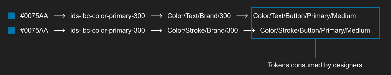
A design token taxonomy refers to a systematic classification and organization of design tokens within a design system. I audited our foundational styles, component library, and designed interfaces to create the hierarchical pattern for developing design tokens. The taxonomy reads right to left, most general to most specific, and covers the usage and application our design system.
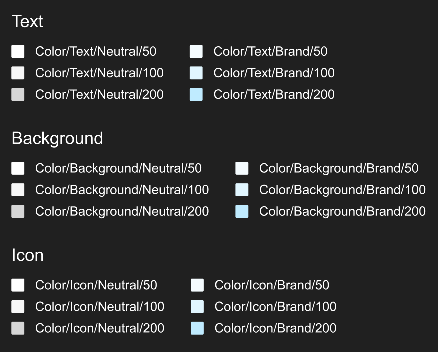
To demonstrate how tokens work to apply the same value to different interface elements, I created an example of alias tokens, applying the same color via different tokens to different elements.
Setup and Management of Design Tokens using Figma's Native Variables
The design system team will continue to manage core color tokens similarly to how they are utilized today. However, with the deployment of variables, each core color will map to a variable (or multiple variables). Product designers will consume variables rather than core color tokens.
Figma's release of variables provides a powerful way to enable and manage variables. As part of this POC, I demonstrated how this new feature can be leveraged.
By creating a core color theme, it allows the design system team to build out themes for different products applying these core colors through nesting. This nested system is how design tokens can be used to seamlessly update color application of single elements within a theme. Additionally, it allows designers to automatically theme the design system for the product they are working on.
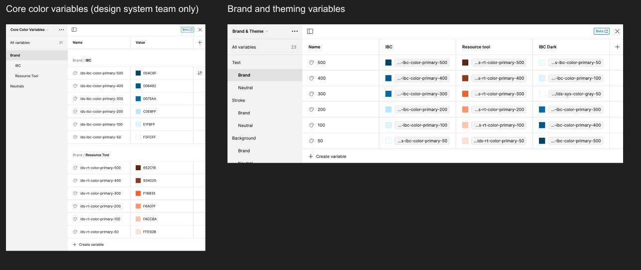
The example below shows how the nested variable theming approach can automatically update the component library to the color styles defined for the product.
Next Steps
1. Discussions with development on code implementation and adoption across the enterprise.
2. Design team working session to solidify design token taxonomy.
3. Design governance team implementation of color variables within Figma color panel.
4. Design governance team applying color variables to components.
5. User testing with design team to validate new variable structure.
6. Begin planning for typography variable support in Figma native variables.
Conclusion
The design token proof of concept initiative has demonstrated how design tokens can reduce the product development cycle for both design and development. For designers, it creates a single source of truth for color style and their applications in an interface so that styles are allows applied consistency. For developers it creates a share repository for color styles. For both design an development, it enables style updates to make seamlessly without having to go back into individual Figma screens and code to manually update new styles. And lastly, for the business, it allows easy theming of products based on business needs.