Independence Blue Cross needed to address pain points in the Primary Care Provider selection process on the member portal. They needed a way to synthesize two provider lookup management tools and improve the ability for members to find their dedicated providers.
Duration: August 2022 - October 2022
My Role: Lead UX/UI Designer
Team: 1 designer, 2 user researchers, 1 product owner, 1 lead developer, 1 BSA, 1 Product Manager
Deliverables: High-fidelity mockups, interactive prototypes
The Problem
Approximately 33% of members require Primary Care Provider (PCP) selection. HMO members are required to select a Primary Care Provider in order to receive covered, non-emergency medical care.
Selection process is housed within the online member portal. Through VOC research, several negative trends emerged causing pain points for members.
1. Half of all members were navigating to the wrong tool to select their PCP.
2. Members were struggling to find their existing PCP due to default filter criteria hiding providers who are not accepting new patients.
Dependencies
The business partners with a third party vendor for provider search capabilities. When searching for a doctor or hospital through Find a Doctor links in the portals, users are redirected to a the vendor tool. However, when assigning a PCP to their plan, members must use the search capability housed within the portal. This API is also provided by the third party.
These dependencies exist as the business relies on the vendor to meet compliance regulations around provider information accuracy and access.
The existence of two provider search features accessibility through the portal, contributes to members navigating to the incorrect lookup tool for their desired task. If a member tries to select a PCP on the vendor site, they will be unsuccessful.
Problem Statements
Members need a seamless and intuitive way to search for providers across different lookup tools so that they con successfully select a PCP and other providers.
Members need to be able to find and assign their existing PCP even when that provider is not accepting new patients.
The Solution
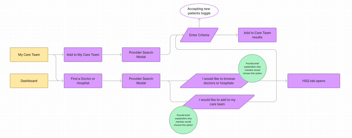
Through collaboration with my user research team, I was able to create a framework around why a member would want to go to the vendor search site or the portal search. I discovered that the vendor site provides more robust information and abilities to compare and contrast providers making it the optimal experience when searching for a new provider. Whereas, the functionality to select a PCP is only possible within the member portal tool.
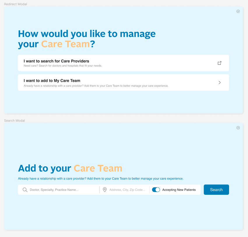
With this information, I created a redirection modal that opens whenever a member selects to find medical care on the portal. This solved for members accidentally continuing to our third party site and trying to add a PCP.
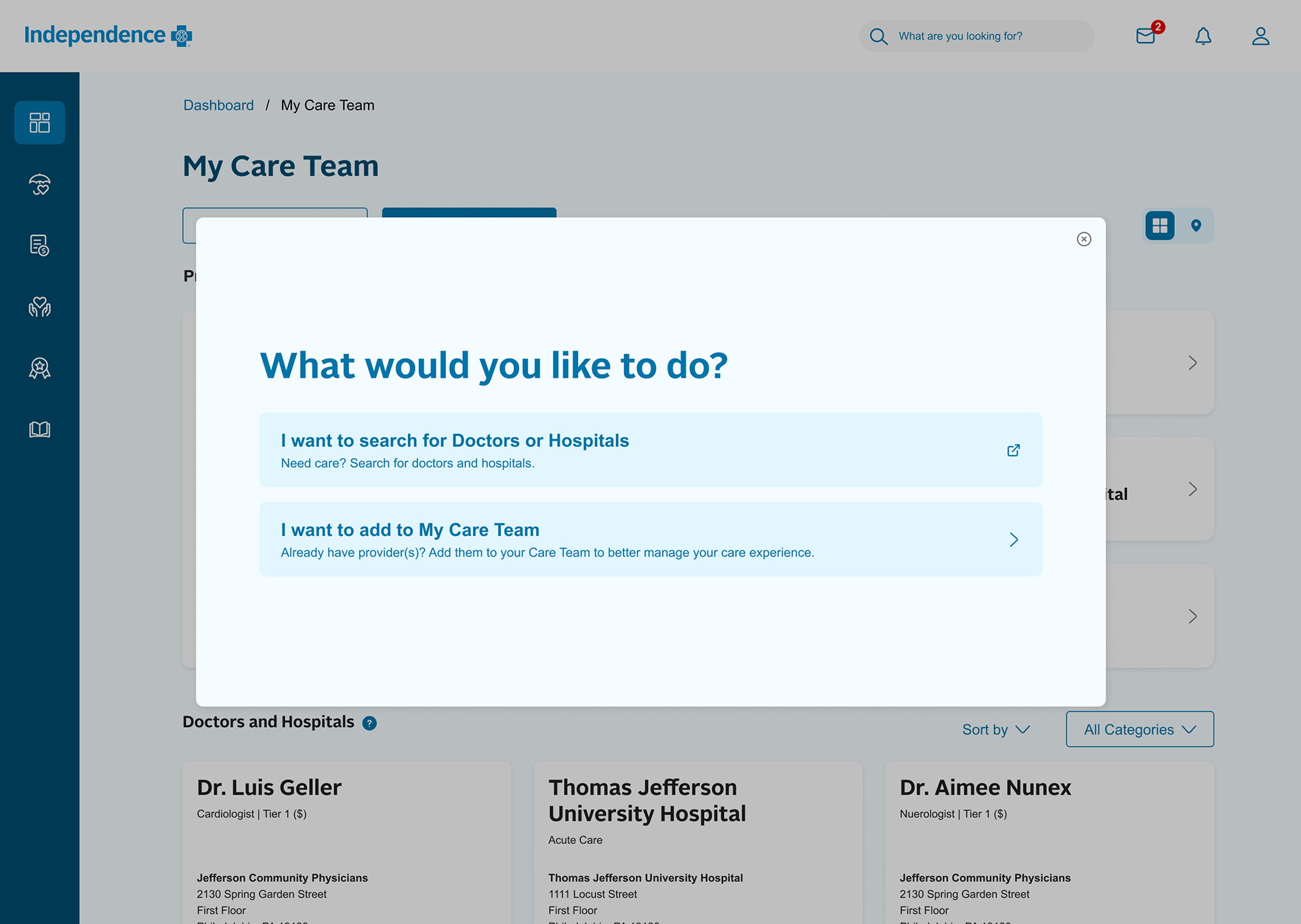
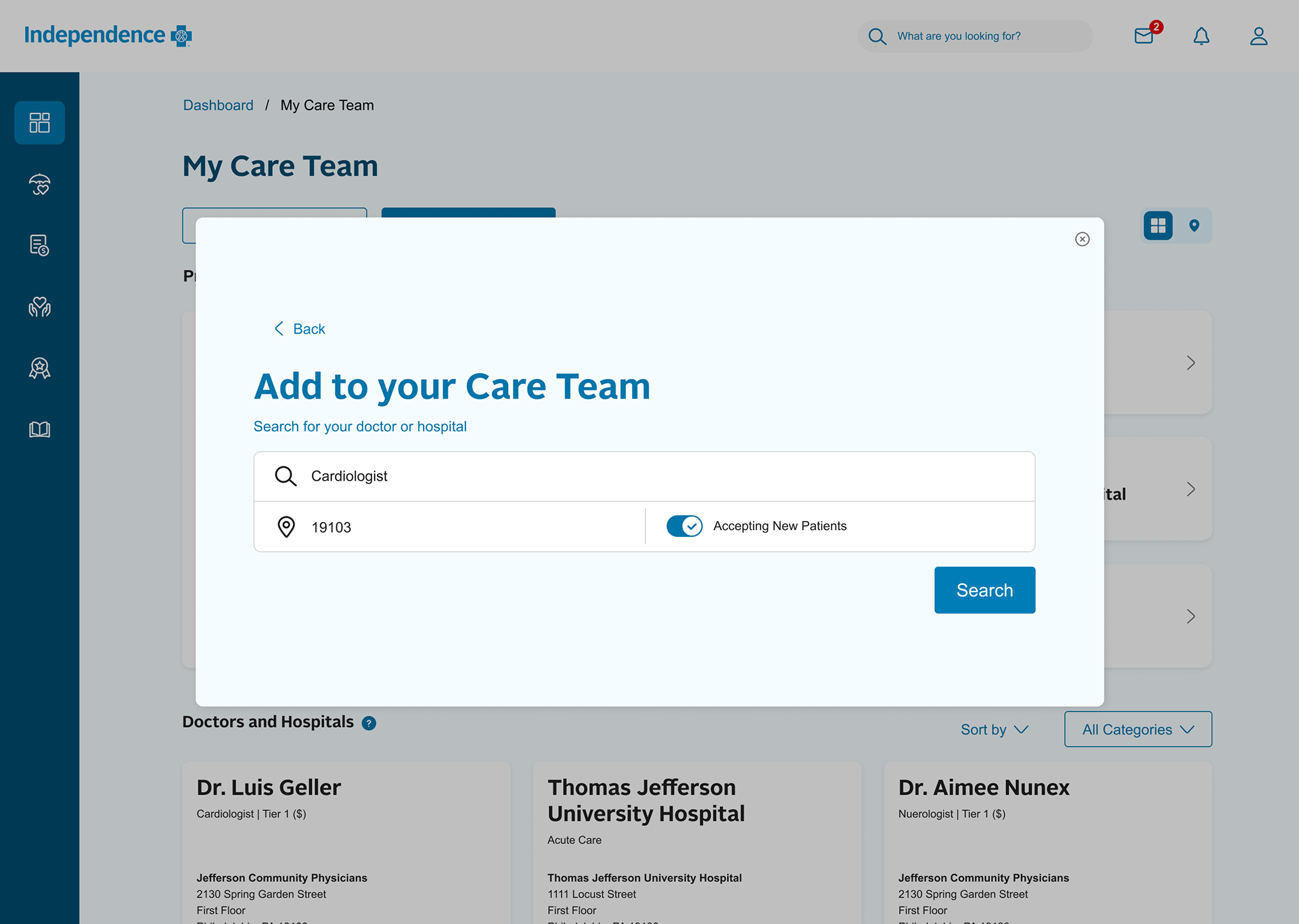
To reduce the instances of error when looking for a provider that is no longer accepting new patients, I brought the filter out of the post search filter panel and integrated it with the search itself. This provides more visibility that the filter is applied by default and allows the user to toggle off upon initial search rather than preforming a search, not finding their provider, and having to hunt around for the filter they likely don't know exists.
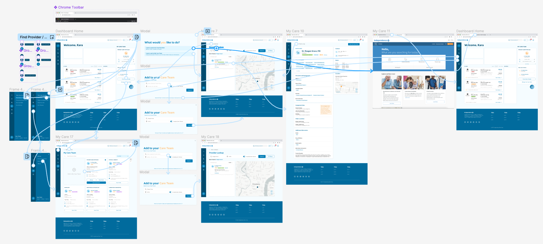
Prototype Walkthrough
The Process
Discovery and Design Collaboration
I led a 10 day sprint focus on partnering with our member experience team to begin understanding the research and recommendations they had consolidated. This sprint consisted of research artifact handoffs, working sessions, refining user flows, and creating how might statements to frame the problem(s).
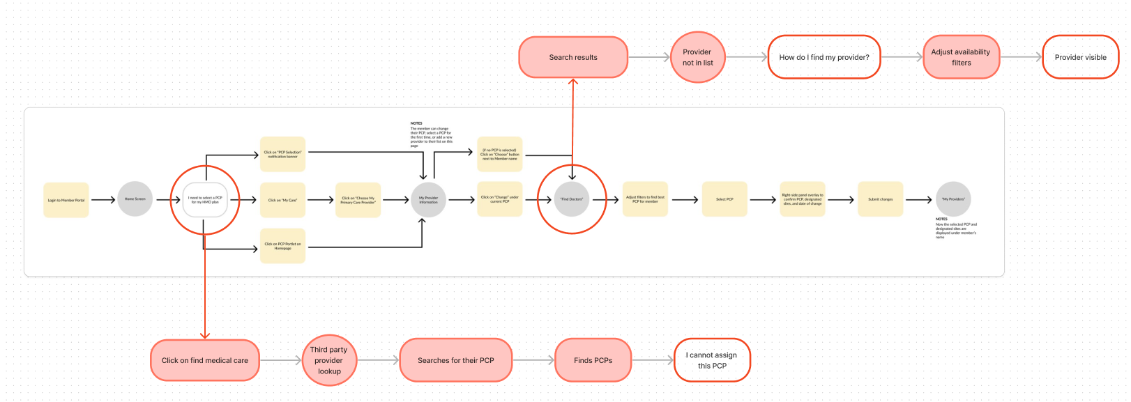
Analyzing the User Journey
I began to analyze the happy path user journey to understand the end to end flow and pinpoint where users were struggling. This helped me visualize where in the PCP selection process users were getting off track. This exercise allowed me to begin brainstorming solutions in the context of the whole experience.
Iterating
Then, I began iterating which started with creating possible user flows. My goal was address the points in the end to end flow above to help keep users on the happy path. These flows were reviewed with stakeholders for feedback, refined, and then finalized before moving onto wireframing and testing.
Once I understood the user mindset and journeys, I started to create mid-fidelity mockups in Figma. I iterated multiple times from sketches to mid-fidelity and presented the following mockups in design review for feedback.
Usability Testing
I then took my wireframes of redirect modal and search modal and built a usability test aimed at validating whether or not the new user journey and designs improved way-finding to the current provider lookup tool.
I asked users to find a new dermatologist as well as add a PCP to their plan.
Results
90% of users were directed to the correct provider lookup tool through the modal design.
Final Design Refinement
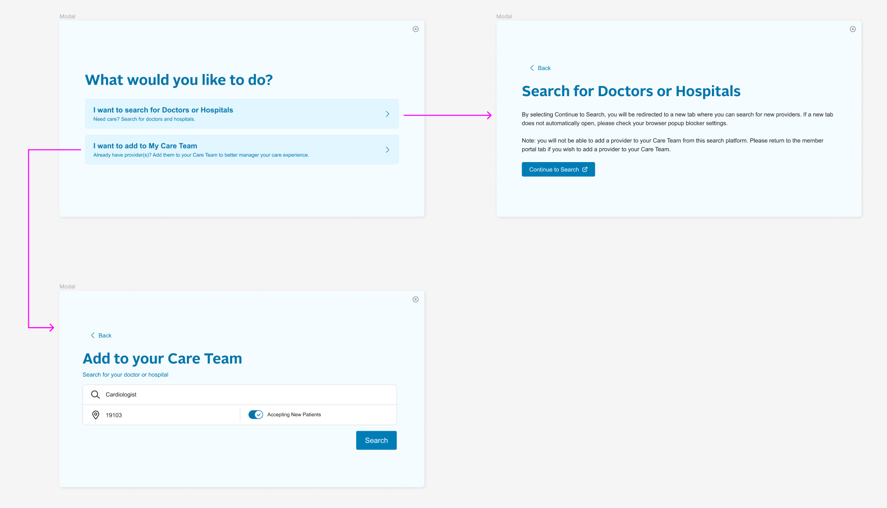
Based on the testing feedback, I refined the designs.
1. Added a confirmation modal to inform the user that they are being redirected to a new tab and selecting a provider for your care team involves returning to the member portal tab.
2. Added a back button to improve navigation within the modal flow.
3. Used a lighter color background for greater text contrast.
4. Removed orange text to improve accessibility.
Next Steps
The flow and designs have been developed and are currently live on the member portal. This feature sits within the larger Provider Connect capability of the portal. We continue to build enhancements for this capability based on research and MVP pilot testing.