Background
I was tasked with leading a design system initiative for the product portfolio at Independence Blue Cross. The goal was to take the existing design system and position it as a global, multi-product system along with a formal process for collaboration and maintenance. Additionally, we needed a way for designers and developers siloed across products to consistently consume the design system.
Existing State
Upon auditing the current state of the design system, there were numerous issues that needed to be addressed in order to complete our goals and create a multi-product design system.
1. Inconsistent use of components and application of foundational styles
2. No formal process for design to development hand-off of design system elements
3. Existing design system not scalable for all enterprise products
4. Siloed teams working across different environments
5. More focus needed on WCAG accessibility compliance
1. Inconsistent use of components and application of foundational styles
Solution: Improved guidelines and documentation by creating a cadence of listening to and learning from our design team.
The existing design system contained guidelines and documentation for foundational styles and the component UI library. However, when reviewing the work our designers were doing across various products, we noticed many instances of custom component work and inconsistent usages of styles and components.
We held interviews with designers to learn more about their understanding of utilizing the design system and where they experienced pain points. We learned that designers were not consuming the available guidelines and documentation and didn't feel confident these existing resources would meet the needs of their use cases.
Over the course of the next several weeks, we held routine design system governance meetings, inviting all of the design team to participate. The goal of these meetings was for designers to bring their uses cases, pain points, and questions to the table. This gave the design system team the ability to discuss these topics and learn how the design system is being used and should be used across different products.
The same strategy was repeated with development to understand their pain points and needs in terms of design documentation.
With more knowledge on the current usage and needs of the design system, we were able to build out more robust guidelines and documentation that better served the needs of our designers. Throughout this process we developed a new template for housing this information with the future goal of publishing the design system to the web.
We continue to hold weekly design system governance meetings to provide a space to socialize current initiatives and updates from the design system team, and continue to discuss and learn how designers are utilizing the design system.
2. No formal process for design to development hand-off of design system elements
Solution: Developed a global design system structure and process for creating and updating components.
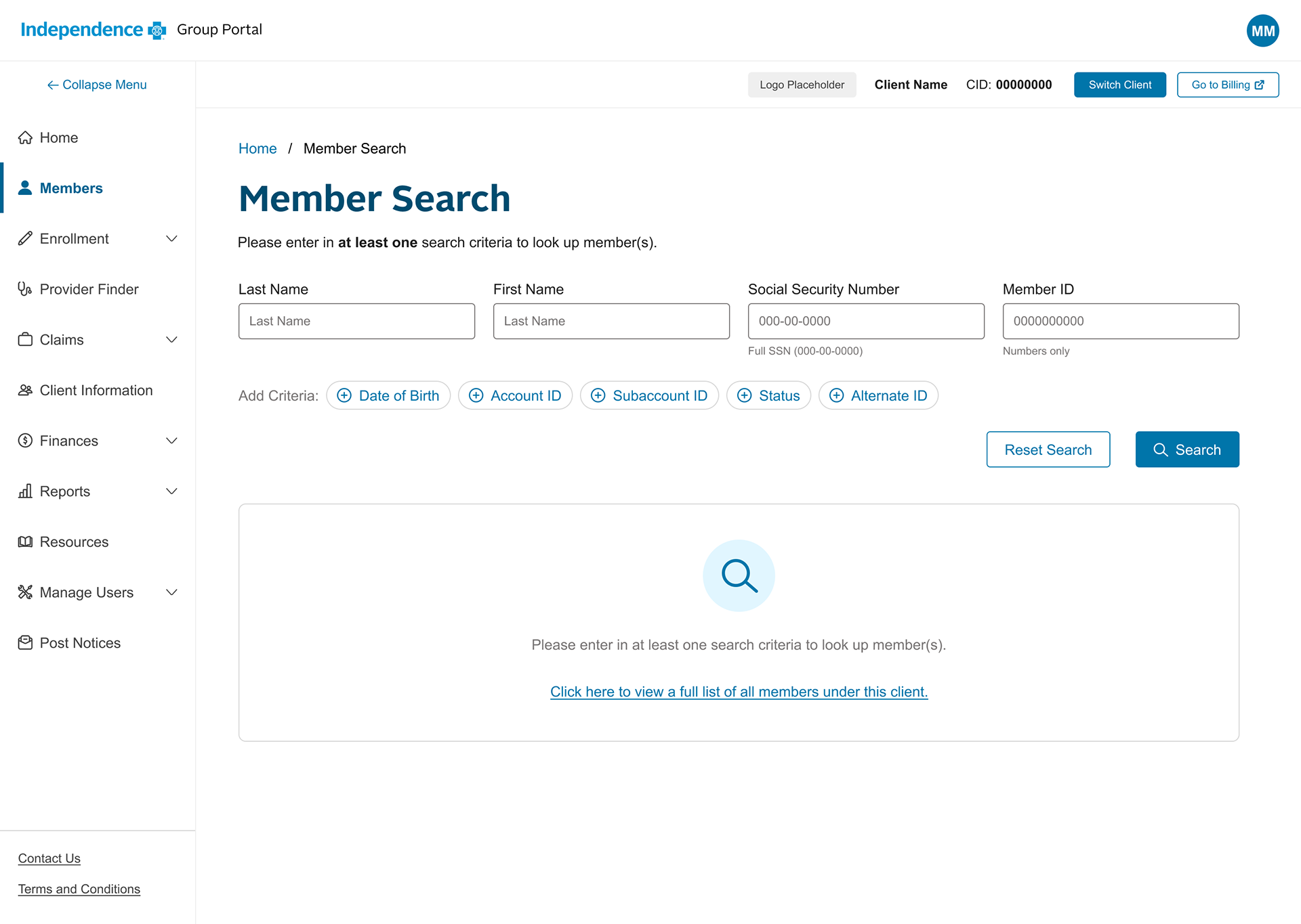
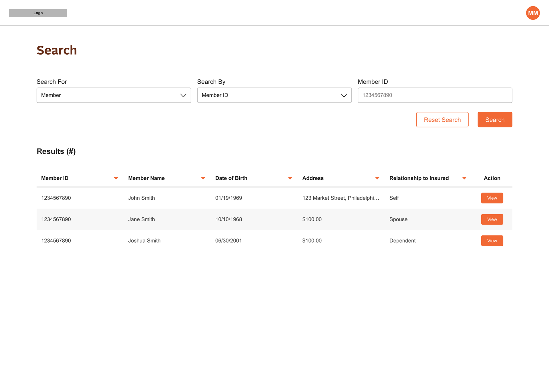
We first wanted to understand how the company product portfolio would be structured with a global, multi-product design system. By auditing the portfolio, we were able to create two groups of products based on similar use cases and styling: internal facing products and external facing products.
Using this approach, we created a structure outlining the relationship between the global design system products within these two groups. A key highlight here was building into this structured anticipated scaling of the design system and company portfolio over time by incorporating how such things as theming.
We created a design system structure were a global library will house foundational styles and common components across all of our products. These are the most commonly used atoms, molecules, subatomic, and organism level elements.
Each product will then be able to design, develop and maintain its own local design system if seen fit by their respective teams. This gives each product the ability to explore other design elements and patterns if needed to accommodate their specific use cases.
Additionally, we created a formal process for how components should be designed and developed at both the global and local levels.
The process for the local system build strategically includes involvement of the design system governance team so that we can be aware of the needs of each product. If we see multiple products individually building similar elements, we can move to include them in the global system so that our product teams can operate more efficiently, and we can ensure consistency of similar patterns across all products.
3. Existing design system not scalable for all enterprise products
Solution: create a more robust design token system to allow for theming and consistency in style application.
Pivoting to one multi-product design system meant we needed to ensure the flexibility of the design system for various products. The design system we started out with was created for external facing platforms, which meant it used more branding, larger fonts, and more playful styling such as corner radiuses. However, this wasn't going to be suitable for most of the internal products which focus much more on data and complex task completion.
Our solution was to leverage design tokens to enable theming of the design system. This approach allows our different product teams to continue to consume the global design system as a single source of truth, but give them the flexibility to apply colors, fonts, corner radiuses, etc. according to their individual needs.
4. Siloed teams working across different environments
Solution: create more lines of communication and intiatives to socialize the design system with development teams.
We created a Teams channel specifically for design system communication to our designers and developers. In this channel, we post updates on what changes are coming down the pipeline, ask questions to help us understand how teams are consuming the design system, and discuss any design system related topics.
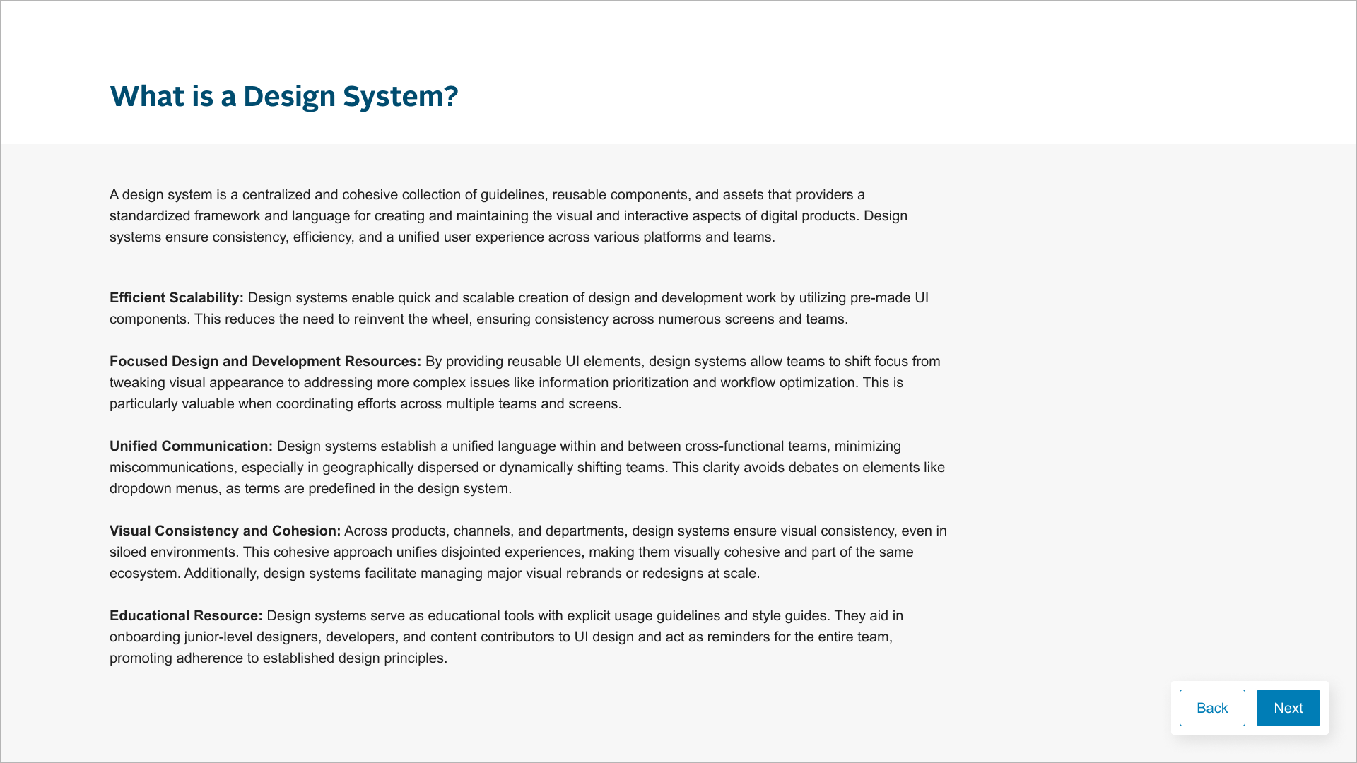
One of the biggest pain points in design system adoption is the lack of awareness development has of the design system and how to use it. To begin to educate on the topic, we created a design system intro presentation which our designers include in every Figma hand-off file. The intro focuses on the basics of the what the design system is, how it can be used, and the benefits.
5. More focus needed on WCAG accessibility compliance
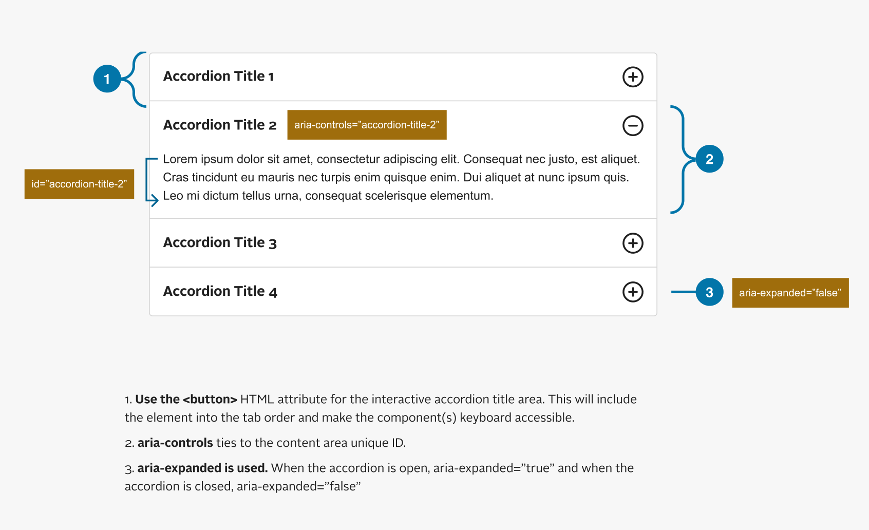
Solution: created an annotation kit to train development on how to code for accessibility.
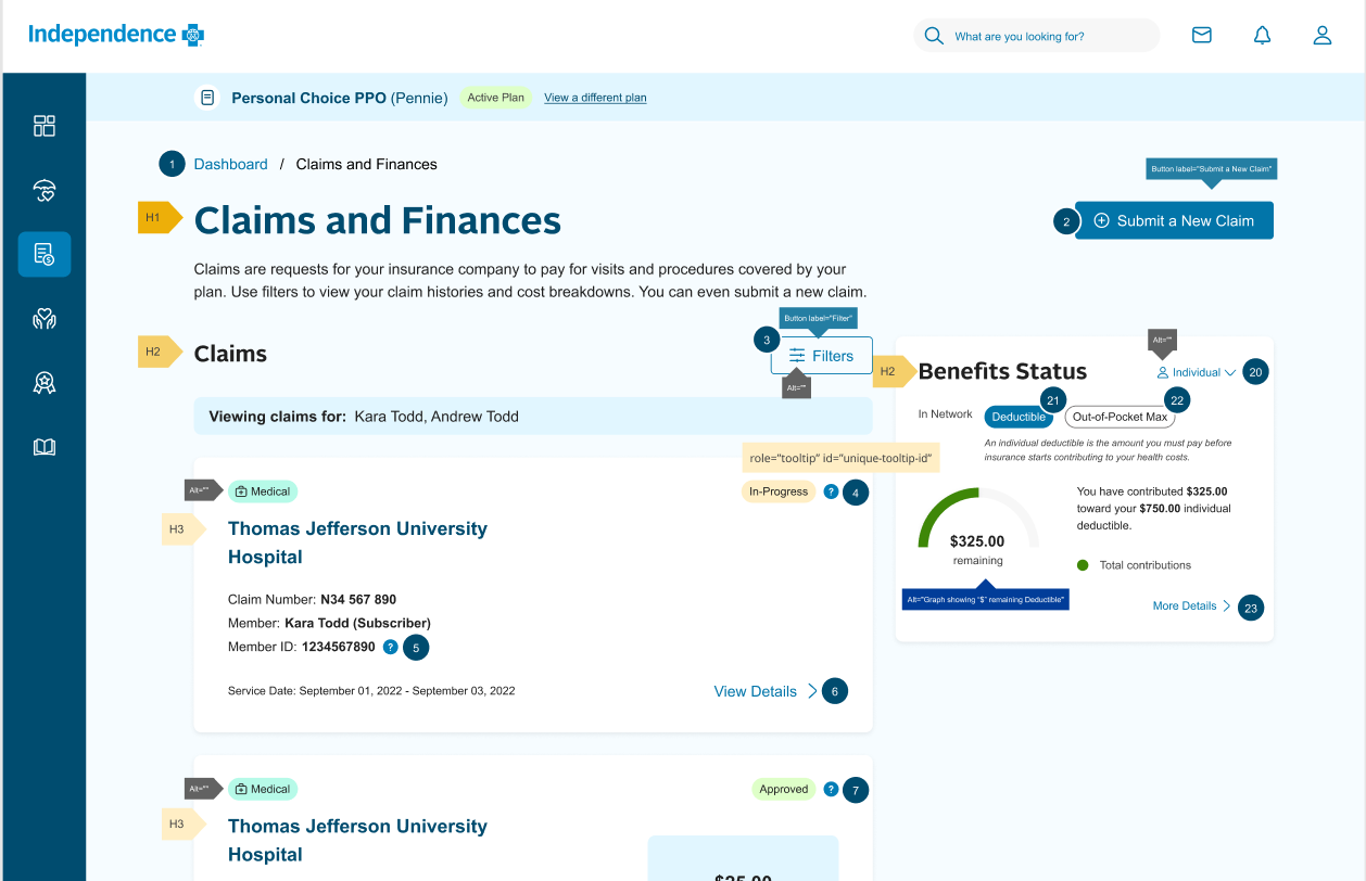
As our products continue to mature, we have expanded focus to include achieving WCAG AA compliance. Our first initiative to begin ensuring compliance was to create an accessibility markup toolkit. This allows us to annotate our design system elements (as well as full screens for hand-off) with information to developers on how to code accessibility into the interface.
Additionally, we created guidelines on color contrast to communicate to designers which color combinations should or should not be used in order to ensure appropriate contrast ratios. As we build out our design token system, color contrast will be built into the semantics.
Conclusion
In conclusion, the case study on creating a multi-product design system highlights the strategic decision to implement a unified and comprehensive approach to design across multiple products. The outcomes reveal a streamlined and cohesive user experience, fostering brand consistency and efficiency in development processes. The design system not only addressed current challenges but also positioned the organization for scalable growth, enabling rapid iteration and adaptation across a diverse product portfolio. Ultimately, this case study underscores the transformative impact of a well-executed multi-product design system in enhancing both the user experience and the overall efficiency of product development within the organization.